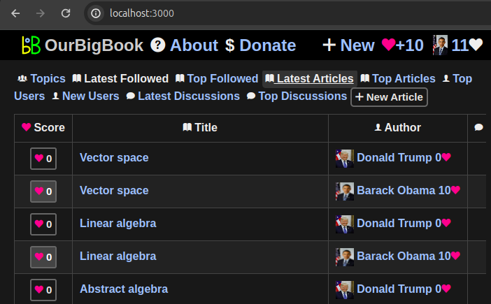
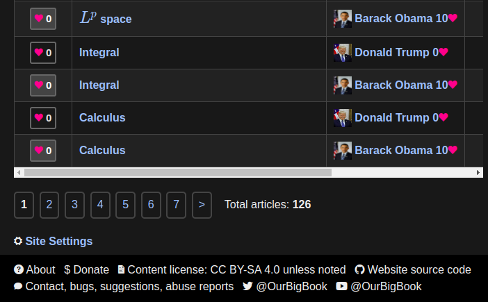
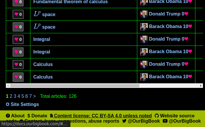
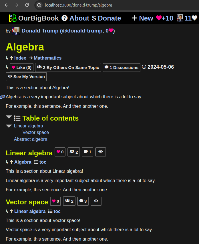
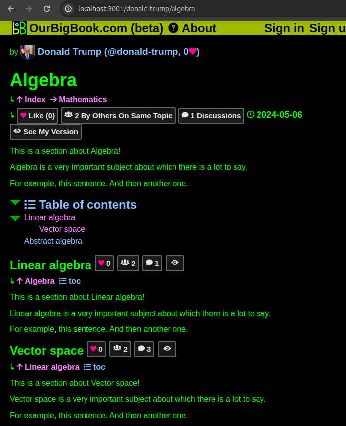
We're experimenting with a more traditional and boring "dark" theme than the green on black classic previously used.
Readability is probably slightly better, though it is hard to measure these things. It is quite possible that the change matter much more for some people than others who have different eye sight phenotypes.
Perhaps the most important outcome of this is that it will greatly reduce the endless complaining from the community. Though perhaps that was a feature rather than a bug?
Beyond the theme change, many other changes were made. Many of those improvements feel like undisputable upgrades, e.g.:
- headers are not colored differently from regular text
- table borders are less visible
- navbar and footer are more discrete and readable
The CSS code was also refactored and it is not much easier to make broad color changes such as these in the future, as color constants are not more closely grouped, and fewer constants are now used.
Large parts of this change were pushed forward by sidstuff who contributed a several code snippets and ideas to it.
